
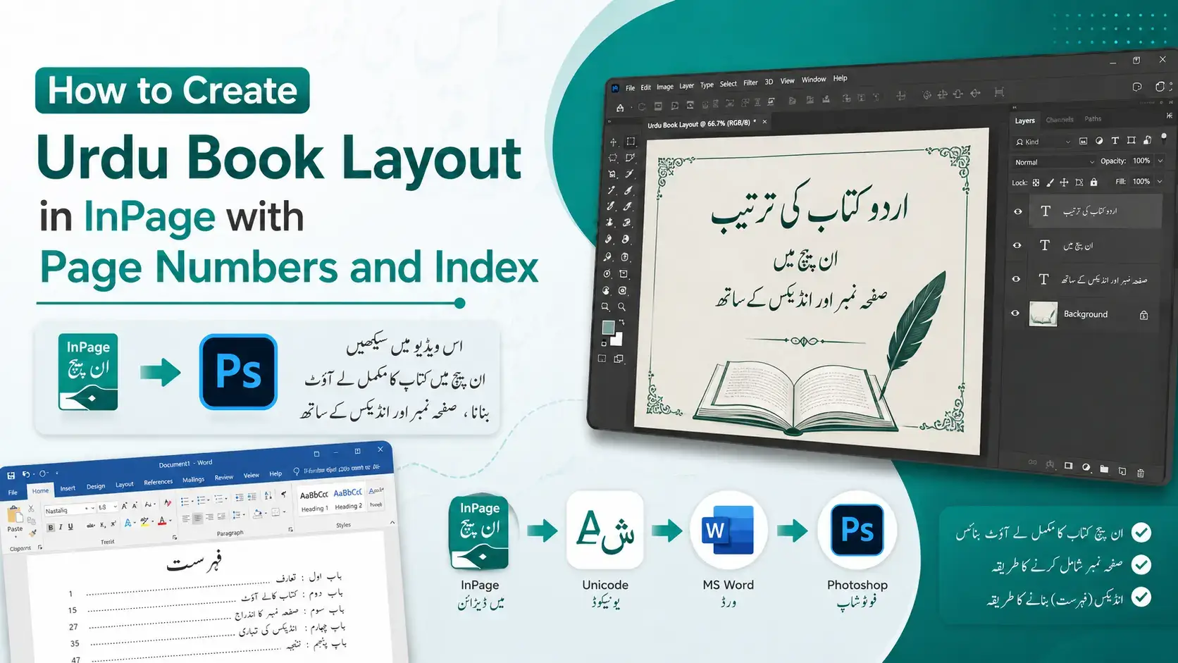
How to Create an Urdu Book Layout in
InPage with Page Numbers and Index
I still remember the first full-length Urdu book I laid out in InPage. It was a poetry collection, a little under 200 pages, and I honestly thought the typing would be the hard part. I was wrong. The typing was the easy bit. Getting the pages to line up, the numbers to sit neatly in the right corner of every page, and the index (فہرست) to actually match the content that is where the real work lives.
Since then I’ve laid out dozens of Urdu books in InPage, from thin booklets to thick reference volumes. In this guide I’ll walk you through the exact process I use to build a clean book layout in InPage, add automatic page numbers, and create an index that doesn’t fall apart the moment you edit one page.
If you are completely new to the software, it helps to first read our walkthrough on how to use InPage software so the buttons and menus I mention below feel familiar.
Table of Content:
- Why a Clean Book Layout in InPage Matters
- What You Need Before You Start
- Step 1: Setting Up Your Document for Book Layout in InPage
- Step 2: Designing the Master Page
- Step 3: How to Add Page Numbers to Your Book Layout in InPage
- Step 4: Flowing Your Urdu Text Across Pages
- Step 5: How to Create an Index (Fehrist) in Your Book Layout in InPage
- Step 6: Adding the Title Page and Front Matter
- Step 7: Exporting Your Book Layout in InPage to PDF
- Common Book Layout in InPage Mistakes to Avoid
- FAQs
Why a Clean Book Layout in InPage Matters
A book is not just a long document. A reader flips back and forth, checks the index, follows page numbers, and expects the whole thing to feel consistent from the first page to the last. If your margins jump around or your page numbers go missing halfway through, it shows and in print, you cannot fix it after the copies are bound.
This is why a proper book layout in InPage is worth setting up correctly from the start. InPage is built for right-to-left scripts like Urdu, Arabic, Persian, Sindhi, and Pashto, and it handles Nastaliq beautifully. Once you give it a solid foundation the right page size, sensible margins, and a master page doing the repetitive work everything else becomes faster and far less stressful.
What You Need Before You Start?
Before you open a single page, get these few things ready. It saves a lot of backtracking later.
- A working copy of InPage. Any recent version (InPage 2009, InPage 3, or InPage Professional) will do for book work. The buttons sit in slightly different places across versions, but the workflow is the same.
- Your Nastaliq fonts installed. Jameel Noori Nastaliq is my go-to for body text because it stays readable at small sizes. Keep a couple of alternatives like Faiz Lahori Nastaliq or Noori Nastaliq for headings if you want variety.
- Your final content, proofread. I cannot stress this enough. Edit your text before you build the index. An index built on text that keeps shifting is an index you will be rebuilding three times.
- A clear idea of your trim size. Decide how big the printed book will be (A5 is very common for Urdu books) and confirm it with your printer before you design anything.
- A basic grasp of the interface. If menus like Insert, Format, and the master page button feel unfamiliar, our guide on how to use InPage software covers the layout of the screen in plain language.
Step 1: Setting Up Your Document for Book Layout in InPage
The whole book layout in InPage rests on how you set up the document on day one. Take your time here.
- Open InPage and go to File → New (or press Ctrl + N) to open the New Document window.
- Set your page size. Pick a standard size like A5, or choose a custom size to match your printer’s trim size. Set your unit (inches or centimetres) first so the numbers make sense to you.
- Set your margins. For a comfortable Urdu book I usually keep the top and outer margins generous and leave a little extra on the inner (binding) edge. That inner space is called the gutter, and it matters more than people expect.
- If your version offers facing pages or mirrored margins, turn it on so left and right pages mirror each other like a real open book. If your version does not have that option, simply add the extra binding space to the correct side yourself.
- Decide on columns. Most Urdu prose books use a single column. Newspapers, digests, and some textbooks use two. Set this now rather than fighting with it later.
- Click OK to create your first page.
Here is the one lesson I learned the hard way: never skip the gutter. On my second book I set equal margins all around, printed a proof copy, and watched the words on the inner edge disappear into the spine where the binding swallowed them. Give the binding side room to breathe.
Step 2: Designing the Master Page
The master page is the quiet hero of any good book layout in InPage. Anything you place on it page numbers, a header line, a thin rule along the top appears automatically on every page that uses it. You design it once, and InPage repeats it for you across the whole book.
- Find the master page button at the bottom-left of the InPage window. It is the small button marked with an “M” in the status bar.
- Click the “M” once. You are now editing the master page instead of a normal page.
- Draw the text boxes you want repeated. For a typical book that means one box near the bottom for the page number, and sometimes a slim box at the top for the book title or chapter name.
- Position and size these boxes carefully. Whatever you set here is what shows up on every page, so a little precision now pays off everywhere.
- Click the “M” again to leave master mode and return to your normal pages.
A small tip from experience: once your master page looks right, get into the habit of not touching it unless you really mean to. I treat the master page as “locked in my head” so I don’t accidentally nudge a header box and wonder later why every page suddenly looks off.
Step 3: How to Add Page Numbers to Your Book Layout in InPage
This is the part most people search for, so let’s get it exactly right. The trick to automatic page numbers in your book layout in InPage is that you add them on the master page, not on individual pages.
- Click the “M” button to enter master page mode again.
- Using the text box tool, draw a small box where you want the number to appear bottom centre is a safe, classic choice, though many Urdu books place numbers in the outer corners.
- Click inside that box, then go to Insert → Page Number.
- InPage drops in a placeholder, usually shown as a hash (#) symbol. Don’t worry that it isn’t a real number yet on the master page it is just a stand-in.
- Format the placeholder like any other text: pick the font, size, and alignment you want for your numbers.
- Click the “M” button once more to exit. Look at your normal pages now, and you’ll see real, correctly counted page numbers appear automatically on each one.
Because the number lives on the master page, it updates itself. Add a page in the middle, remove one, rearrange a section InPage renumbers everything for you. That is the entire reason we do it this way instead of typing numbers by hand.
Keeping Page Numbers Tidy in an RTL Book Layout in InPage
Urdu books open from the right and read right to left, so your odd and even pages sit opposite to what English layout people are used to. A couple of things help:
- If you want numbers in the outer corners, remember the outer edge flips between left and right pages set your boxes with that mirror in mind.
- For the title page or cover, you usually don’t want a visible number. The simplest fix is to keep that number off those specific front pages, or to design the front matter so a number there isn’t distracting.
- Always scroll through the finished book once and eyeball the numbers. It takes two minutes and catches the rare odd page that slipped out of place.
Step 4: Flowing Your Urdu Text Across Pages
A book is one long story poured across many pages, so you want your text to flow from page to page on its own rather than copying and pasting block by block.
- On your first content page, draw a text box inside the margins where the body text should sit.
- Type your Urdu text, or paste it in if you have already prepared it elsewhere.
- When a box fills up and text overflows, link it to the next box so the extra text flows forward automatically. Linked boxes behave like one continuous container edit early text and everything after it reflows to fit.
- Add new pages as you need them with Insert → Page, and link each new text box into the chain.
- Apply your Nastaliq font and a comfortable line height. Nastaliq sits on a sloping baseline, so give your lines a little more vertical space than you would for English cramped Nastaliq is hard on the eyes.
Font choice genuinely affects how finished a book feels. For long-form reading I lean on a clean, even Nastaliq at a modest size with relaxed line spacing. Save the more decorative fonts for chapter titles where they get room to shine.
Step 5: How to Create an Index (Fehrist) in Your Book Layout in InPage
Now the part that trips people up. When most Urdu authors say “index” they mean the فہرست — the contents list at the front that names each chapter or topic next to its page number. There are two honest ways to build it in your book layout in InPage, and I use both depending on the book.
Method 1 — The manual fehrist (what I use most):
- Finish and lock your content first so page numbers stop moving. This single habit prevents most index headaches.
- Create a fresh page near the front for your فہرست and give it a heading like “فہرست مضامین”
- Make a two-part layout: chapter or topic names on one side, page numbers on the other. A table works neatly here and keeps everything aligned.
- Go through the book, note the page each section starts on, and type those numbers in.
- Read it back against the actual pages once. Always. The five minutes you spend checking is cheaper than a reprint.
Method 2 — The Index Entry feature (for an alphabetical index):
If you are building a back-of-book alphabetical index (an اشاریہ of terms), InPage can help. As you work through the text, select a word and use Insert → Index Entry to mark it. InPage tracks these entries so you can compile them into an index list. It takes more setup than a simple فہرست, so I reserve it for reference books where readers really need to look terms up.
The reason I’m so firm about locking your text first: on that very first poetry book, I built the فہرست early, then the author sent “just a few small edits.” Those edits pushed every page number out by one or two, and my lovely index was suddenly wrong from top to bottom. Build the index last. Every time.
Step 6: Adding the Title Page and Front Matter
Front matter is everything that comes before the main content the title page, the author and publisher details, a dedication, and a preface. It gives the book a professional, finished feel.
- Add a few pages at the very front with Insert → Page.
- Build a clean title page: the book name in a larger, attractive Nastaliq, then the author’s name, and the publisher below.
- Add any preface or dedication pages you need, each in its own clear space.
- Keep visible page numbers off the title page so it reads cleanly.
- Step back and check that your front matter, body, and index all share the same margins and overall feel. Consistency is what separates a real book from a stack of pages.
Step 7: Exporting Your Book Layout in InPage to PDF
Once your book layout in InPage is complete, you almost never send the raw InPage file to a printer. You send a PDF. PDF locks in your fonts, your Nastaliq shaping, and your exact layout so the printed book matches what you see on screen no surprises, no missing fonts at the print shop.
- Save your finished InPage file first, then keep a backup copy somewhere safe.
- Do a final read-through of the whole book on screen numbers, index, margins, the lot.
- Export to PDF, ideally at print quality so the Nastaliq stays crisp.
- Open the PDF and check it page by page before sending it anywhere.
For the full walkthrough including the cleanest export settings and how to handle fonts so nothing breaks follow our detailed guide on how to convert your InPage file to PDF. It covers the exact steps I rely on before sending any book to print.
Common Book Layout in InPage Mistakes to Avoid
Most book layout problems are not complicated they are small habits. Here are the ones I see most often, and that I’ve made myself.
- Skipping the gutter margin. Words vanish into the spine. Always leave the binding side extra room.
- Typing page numbers by hand. They fall out of sync the instant you add or remove a page. Use the master page method instead.
- Building the index too early. Lock your content first, then build the فہرست. Edits made afterwards quietly break your numbers.
- Cramming Nastaliq lines together. Tight line spacing makes Urdu hard to read. Give the script breathing room.
- Sending the raw InPage file to print. Export a PDF so your fonts and layout travel safely.
- Not proofing a sample. Print or preview a few pages before committing the whole book. It is the cheapest insurance you’ll ever buy.
Frequently Ask Questions:
Can InPage add page numbers automatically?
Yes. Add the number on the master page using Insert → Page Number, and InPage applies and counts it on every page on its own.
Does InPage create a table of contents automatically like Word?
Not in the same automatic way. For a chapter-style فہرست, most people build it manually once the page numbers are final. For an alphabetical index, the Insert → Index Entry feature helps you mark and compile terms.
What page size should I use for an Urdu book?
A5 is a popular, comfortable size for Urdu books, but the right choice is whatever your printer recommends for your trim size. Confirm it before you design.
Which Nastaliq font is best for a book layout in InPage?
For body text I prefer Jameel Noori Nastaliq because it stays clean and readable at smaller sizes. Decorative fonts are better kept for chapter titles.
How do I keep page numbers off the title page?
Design your front pages so the master page number does not show on them, and keep your visible numbering on the main content where readers actually need it.